Thursday, November 29, 2007

Windows in the Basement


I've mentioned the Hub's video windows on a few occasions so it seemed time to do a longer post on the topic.

Planning Process and Technical Details

Early in our year-long process planning the Hub, one of our workgroup committee members (the director of our Fine Arts Library) envisioned dynamic art displays on the six large, bare white walls that form the rotunda where the Hub service desk is now located. The walls are recessed between structural marble columns, and in our planning process, many of us could imagine each of these displays as sort of a "window." Gail worked closely with a faculty member focused on new media in the art department to develop a proposal for these "video windows" and secure funding via a grant.
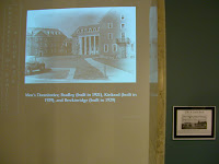
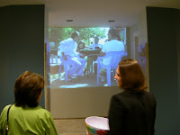
Running since we opened in March 2007, the video windows consist of six ceiling-mounted Epson projectors. The projectors are linked via conduit in the ceiling to six Panasonic DVD players located back in our office area. We run some software on a computer which allows us to quickly and easily change the signal for each projector (like magic, there's the UK game!). If you want more technical details, I'm glad to share them.

It sounds simple, but as things go, it was very challenging to install the conduit and run the cable. Much of the 20,000 square foot area is hard ceiling which requires access panels to be cut every so often in order to run cable. While we reside in one of the most beautiful and magnificent libraries in the country, it's not always easy to mess with the original architectural intentions.

At one point we considered HD TVs to minimize running cable, but our faculty consultant felt strongly about the artistic effect of the projected images. Like an exhibit in a gallery, she selected the projectors and the placement for maximum effect. After having lived with these projectors for nine months, I have to say I think the HD TVs would have been an awful choice.

Staff Time and Ongoing Maintenance

As far as initial staff time, there was a fair amount of setup even though a contractor did the actual installation of the equipment. Certainly we spent a lot of time discussing the placement and the specific equipment we'd use. We had to learn how to use the equipment. We also had to create our policy and put together a year's worth of ideas up front.

As far as ongoing maintenance, one of our audiovisual staff turns the projectors off at closing time and back on again when we open. Bulb replacement will be part of that maintenance, though we've been running on the same bulbs since March. We are also aware that the projectors will have to be replaced at some point and are planning for that.

Our exhibit calendar is set for the school year, though I follow up with future exhibitors a couple of months in advance and work with them to get the DVDs and descriptions of each display. For PowerPoint presentations, we burn them in house using PPT2DVD.

Content
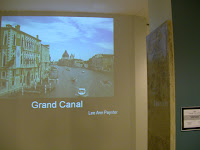
And on to the fun part--what to show? Our inaugural exhibit was created by the new media faculty member who assisted us through the planning process. The exhibit was six short films of day-to-day life in Turkey: a beauty parlor, a cafe, the fish market, and three other locations. It was a fascinating slice of life in what is an unfamiliar setting to many of us.

While running that exhibit during our opening months, we formed a Video Windows Committee to select exhibits for the coming year. The initial Video Windows Committee was composed of four library staff (Fine Arts, Hub, and Archives), two art/new media faculty, and the leader of the student art studio majors organization. In addition to selecting the content, the Video Windows Committee finalized our Video Windows Policy.

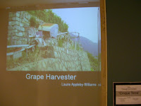
We display something different each month. So far we've typically displayed student or faculty work or material from our archives. We do display ballgames as appropriate (we are UK!) as well as short-term displays (horror movies on Halloween for example). A few examples of past exhibits:

August -- "This is Kentucky" focused on university and Lexington archives

September -- "Italy Through our Lenses" student images from a study abroad photography course

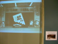
October -- "Curiosities and Wonders of the Archives" in celebration of National Archives Month (the mustache blog accompanied one of the windows in this exhibit)

November -- "Data Visualization at UK" video of cutting-edge visualization projects on campus


We've gotten a number of positive comments at the desk about different exhibits. The October exhibit was mentioned in the local paper so we had several visitors in specifically to see the exhibit.

Future Plans

I've worked directly with the art studio majors on one exhibit, and we have a couple more in the works. Next year, I'd like to see more student work (this year will be about 30%). One thing I'd like to do is display the BFA and MFA portfolio slides for graduating art studio students at the end of each semester. I also see the windows as a great opportunity for showcasing some of our compelling archival materials that are likely unfamiliar to our students. The few archival exhibits we've done so far have certainly caught the eye of passers-by and I think we could do much more with this--maybe working with a class on a project using some of our primary source materials and then display the results. Finally, I do plan to implement one of our very first video window ideas--actually point one of them to an on-campus web cam so that we can know if it's raining or snowing or sunny (with good reason, as in Kentucky you'll often hear: "if you don't like the weather, wait 20 minutes.")
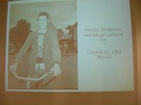
I'm almost embarrassed to say it now, but initially I was somewhat skeptical of the project. To me, it seemed like (pardon this) window dressing. We had so many other needs in planning our information commons and yet we were spending so much time planning something decorative. In the past nine months we've been open though, I've found the windows to be an compelling and useful element at the Hub. As a showcase for student art, a venue to work more closely with students and faculty, to simply an attractive feature in the space and a convenient place to show ball games or play video games, I have to say the video windows are one of the most striking features of the Hub. They really add to the space and I do feel they generate an energetic, creative vibe to the basement.

I'm so glad we included the video windows in our original design, and I am continually looking for new content and new ways to use the video windows, even though we are booked through May 2007. Suggestions?

(Photos by Alice Wasielewski)

Wednesday, November 21, 2007

Is Your Commons 2.0?

The new issue of Educause Quarterly includes an article about Commons 2.0. The five guiding principles behind commons 2.0:
it is open, free, comfortable, inspiring, and practical [my emphasis]
Defining features of a commons typically include floor plan design, furniture, and equipment that are ideal for collaborative multimedia projects. Adequate wireless coverage, plenty of electrical outlets, and comfortable furniture are also routinely mentioned as essential features of a commons.

I'm pleased to see that an inspiring space is one of the principles of this Commons 2.0 model. It's something that I haven't seen addressed much yet, but I think it's important to develop a space that encourages artistic and creative impulses. At the Hub, we feature video art projected on six large walls in the space. We display a different exhibit each month and try to incorporate student work as much as possible. I'd like to do more with student art in the coming year, and I know there are other ways we can foster creativity as well. Any suggestions?

Redesigning the Service Desk


One of the things I greatly enjoy is being contacted by librarians from other schools. If it isn't already obvious from this blog, I love sharing stories about what we do at the Hub.

When I am contacted by another librarian, it's usually about services or furniture or our big Hubbub party or something along those lines. But by far the question I get most frequently is about our service desks:
  • How do you like those desks/kiosks/whatever you want to call them?
  • How are you using them?
  • What do the staff think of them?
  • How do students react to them?
  • Where do you put your "stuff"?
  • Can you take those off-road? (to be fair though, only one librarian asked me that)

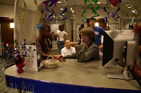
In our planning process, the Information Commons Work Group decided early on to drop the idea of the formal, permanent service desk. A few of us on the group (admittedly, myself included) were initially unsure of this plan. After all, we were plunking down two mall kiosks (let's face it--that's what they are) in the center of the room. Would it be obvious that it was a service desk? How comfortable would it be to work there for an extended period? And yes, where do we put our "stuff"?

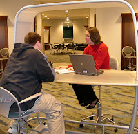
I have to say that these desks have worked better than expected. They serve well as the help desk for IT and library staff. The desks are easy to approach, and it's easy to see much of the basement from the desk. The enormous "help help help" sign on both sides makes it pretty obvious that we are a service desk, though we occasionally get:

"Help with what?"

And less frequently, thankfully:

"Do you work here?"

We do continue to improve our signs, though I think some of the "help with what" questions will be inevitable. Our best answer to "help with what" is on several of our signs (thanks, Alice!):

"If we can't answer your question, we will refer you to someone who can."

It's funny though how ingrained we are to look for a very official service desk and approach it from the front. In addition to those people who ask "do you work here?" or "what kind of help?" we get those people who will walk around to the "front" of the desk to speak to us. Even as they are talking or we are talking, they will trek around to the "front" for service. Interesting.

As far as staff, early on some were apprehensive about the desks but as far as I know, everyone seems pretty comfortable there now. Some staff choose to roll the awning up, others choose to move the monitor, rearrange the chairs, etc. That's the great thing about the Hub--practically everything is on wheels and can easily be reconfigured. We solved the "where do I put my stuff" problem early on by purchasing a couple of large plastic bins to store under the desks. These contain paper clips, paper, forms, extra pens and pencils and such. We've all found though that when you work at such a minimalist desk, you rarely have the need for the "stuff" in the bins. Funny how that works.

The desks are a bit cumbersome to move (you have to unplug everything of course first) but they can be rolled to a different location. We really don't do that much, other than occasionally change the angle of the desks or roll them slightly forward or back. We did move them slightly the night we had the Palm Reading Librarian at the desk, but for the most part, they stay where they are. We have learned the hard way that they barely fit in the freight elevator when assembled. But that's a story for another time. For now, no off-roading for us.

Saturday, November 17, 2007

The Hub is an Orange Property!

This year's homecoming theme was Catopoly, a play on Monopoly. The Farmhouse fraternity's float featured a number of campus entities, including the Hub (thanks for the pictures, Shawn!).

The Hub ranks up there with the Johnson Center (our fine new student gym) and Ovid's (easily the best place to eat on campus). Sure, we're next to the Go To Jail space, but we're worth $120--$10 more than the Johnson Center. Thanks, guys!

What Kind of Rooms?

Seems that someone had some fun with the AV Service Desk sign recently:

Kentucky Chapter Second Life Event

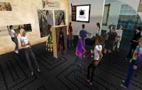
Attending a Kentucky Chapter of SLA event is always a pleasure, and Friday's meeting about the virtual world Second Life was no exception. After a pleasing lunch at Ramsey's (with pie!) and perhaps the shortest business meeting ever (34 minutes, thank you, Susan!), we met back at Young Library for a hands-on workshop about Second Life.

Local expert Beth Kraemer provided an overview of Second Life and graciously invited us to her "home" for multiple examples of online exhibits, educational uses, and of course some drinks, dancing, and other freebies. For a few of us, the session became more about a clothing swap but others learned the basics of moving around and interacting with other avatars.

The IT division of SLA held a meeting in Second Life back in the fall. While there are still technological obstacles to doing this on a regular basis, I think it's useful to try different methods for meeting. Even though I immensely enjoy the company of my SLA colleagues, who says we have to meet face-to-face every time?

Friday, November 09, 2007

UK Libraries Orientation Video

In summer 2007, three librarians and I embarked on a project to revamp the freshman library orientation experience. In previous years, freshmen taking the university orientation course (UK101, which at this time is not mandatory) spent one class session at the library. The class was split into half PowerPoint presentation from a librarian, half tour of the library.

We were happy with the tour portion of the class but knew that the PowerPoint presentation was in need of updates. Several of us felt it might be lost in a sea of other introductory PowerPoints from other campus entities. How many orientation spiels are first year students treated to in their first three weeks of classes?

For a number of reasons, we thought it might be interesting to try a short video using Second Life avatars for at least a portion of the video. Each of us had some experience or skills to contribute to the project: library instruction experience, script writing abilities, Second Life building skills, a sense of humor, some editing skills, and a desire to see what's possible. We shot half of the film "on location" in Second Life and the other half on campus (with an albeit shaky hand camera). The acting (real and virtual) was done by students or library staff.


UK101 students either laughed at the right times or rolled their eyes--a reaction I was expecting, but figured was satisfactory nonetheless. After all, how much can you really cover in a short orientation in those first critical weeks? Our goal is to simply offer up the library as a friendly, convenient place to go to get help. At this stage, there's no time for database searching demos or the like. Just show that all our libraries are full of helpful librarians, computers, writing help, and other services. And by showing them a video, our hope is that it will be memorable, not lost in a sea of PowerPoints.

I have a great deal more to say about each step of our process, particularly how I edited the video and how I would do things differently next time (steady cam for sure!). The four of us are working on a presentation proposal about the entire experience so I'll likely save many of the details for that. In the meantime, take a look at the finished product.

Facebook Pages Update #3

As I suspected, Facebook is still fine-tuning the Pages feature. Today when you choose Edit Page, under Applications you can click on Browse More. This will bring up a list of applications that will work with the new Facebook Pages. Unfortunately the choices are still few--less than 300 in each category. Favorites like Meebo aren't there either (which by the way, is anyone else having trouble with Meebo via profile?). I suspect this is still a work-in-progress. In the meantime, you could offer Movie Quiz or Super Wall on your Page. Or the where's the closest Starbucks app--that might actually be useful for some libraries.

This morning's search of Facebook Pages yields 36 "library" and 6 "libraries." The few I looked at this morning are populated with librarian fans--relatively few users at this point. That's a concern I mentioned in an earlier post. It's still early though. We'll need to offer something compelling on our pages...what are your ideas?

Thursday, November 08, 2007

More on Facebook Pages

In yesterday's post I wondered if Facebook Pages would be available via search. It seems that's true today. If you do a search in Facebook, Pages now shows up as a tab like People, Groups, Events, or Applications. I have noticed that it seems to be searching the page name only, so perhaps my naming us "University of Kentucky Libraries" wasn't too wise. Who's actually going to look for "Libraries"?

So I created an additional page today, loaded with keywords in the title, and more focused on the Hub: The Hub @ Young Library (UK Libraries). We'll keep them both updated as we did with our Facebook groups. I spend much less time on that than whipping through my email every morning.

Perhaps the search thing is something that will be modified down the road. I also wonder about Facebook apps and how they can be used with Facebook pages. Obviously this is still a work in progress for Facebook. Certainly they are going to make it easier for advertisers to reach users--we librarians just happen to be benefitting from this. As a Facebook user, I do wonder about these Social Ads and how in-your-face they may become. Like many Facebook users, I don't want it to become MySpace. Ugh.

I have created a Facebook group to discuss applications of Facebook pages further: Libraries Using Facebook Pages.

UPDATE

Wednesday, November 07, 2007

Facebook Pages are Here

The Facebook blog had some exciting news for us this morning. As you are likely aware, in Fall 2006 Facebook began shutting down library profiles. Their reasoning was that library profiles were "fake"--i.e., profiles can only represent individual people, not organizations or other entities.

This morning Facebook has launched a new advertising mechanism that will allow organizations and other entities Facebook pages which are:
distinct, customized profiles designed for businesses, bands, celebrities and more to represent themselves on Facebook.
So cool--we can now build an official page for the library. When creating a page, one of the categories for the page is "Library/Public Building." I'm pleased that somebody at Facebook recognizes library interest in Facebook. The Facebook Page allows you to post your hours, as well as upload video, organize photos into albums (something sorely lacking in Facebook Groups), as well as take advantage of the wall, discussion board, events, and all the usual stuff. The cutesy thing is that friends of your page are "fans."

I'm excited at the prospect of creating a page for the library (in fact, I did so almost immediately). I realize the page may not have a great deal of impact (after all, how many students really look to Facebook when they've got a library question) but it was easy enough to create and it's always a good idea to spread the word about the library. I often describe our Facebook presence (we still have a couple of Facebook groups) as just another way to contact us. UK's Facebook profile which lived June-September 2006 yielded three chat reference questions plus several wall posts resulting in a conversation about library hours and some other general queries. For the minimal amount of effort it took to create and maintain our presence, I think it was definitely worth it.

I do wonder who will see our new Facebook Page. It's unlikely that I will buy an ad any time soon (we have bought ads for big events though it's difficult to assess how effective they are). Since I'm not advertising the Facebook Page, who will see it other than my friends who noticed it in my News Feed? Or colleagues who read about it on my blog or in the comments on Michael's blog? Facebook indicates that the pages will spread virally so I suppose the question is--how can I get the library page going virally? (Other than posting videos like this, of course.)

Will this just be another library entity on Facebook that is full of librarians and virtually no library users?

Time will tell, but I remain excited about this.

Update TWO

Update THREE

Monday, November 05, 2007

Mustaches Continue to Inspire

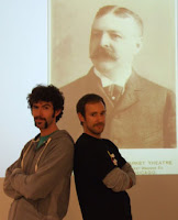
I just replaced the National Archives Month exhibit in the Hub on Thursday. One part of the exhibit was that notorious "Mustaches of the 19th Century" display with accompanying blog that was noted on BoingBoing and many other places at this point. Imagine my delight when a staff member called me, disappointed that the mustache exhibit had been taken down. Apparently the exhibit/blog inspired some staff members to have a mustache contest. Pictured are a couple of the staff who were inspired (impressive 'staches, Josh and Jesse!)

Now this was a fun way to celebrate National Archives Month. What could we possibly do next year to top this?

(Photo by Cheri Daniels)