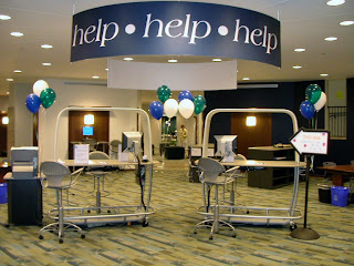
 So I was wrong.
Labeled with our signature "help help help" sign, our commons desk offers library and IT assistance as well as any kind of directional assistance you might imagine. In addition to the "traditional" things, we've helped students find their advisors, parents find good restaurants, community members find where to print on transparencies, and so on. You know how it goes, and we're delighted to do it. Anyway, I envisioned this desk as the one desk to rule them all: we'll help you with anything, we'll refer you anywhere, just consider us your first stop when you have a question.
So with that line of thinking, I was adamant that we not define the desk with a bunch of signs. If we start describing what we do, inevitably we leave out something. We also make our users choose--is it an IT question or a library question? it's an IT problem, but it's with a library thing, so where do I go? or maybe I shouldn't even bother asking this person since it's neither (here's a rant from last summer about this very topic). So despite the occasional staff suggestion for something more descriptive at each desk, I insisted that we keep it simple.
And what happens when you keep it simple?
Generally I think it works, but I can't count the number of times we've gotten "I'm not sure if you can help me with this..." or "what kind of help?" or even, "do you work here?" While there is a 20 ft sign labeled "help help help" above our heads, I can see where these patrons are coming from. Is this a library help desk to help me with library things, or is it a desk more like the information desks you see in the hospital? You can give me a room number, but you can't actually diagnose anything? Despite a lot of publicity and frequent mention in orientations, tours, and a variety of campus events, until someone is right in front of us with a need, they don't think about what exactly it is that we do.
So I relented. Let's be more specific on our signs.
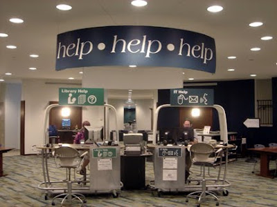
That's where the fun begins. What do you call it? Reference, research, information, library, Hub, help, assistance...then there's IT, Information Technology, Customer Support, Customer Service, technology, help...We talked about it at length, as I'm sure you have too, and kept struggling with how to label without limiting and yet be descriptive. We hit upon what I think will be the perfect solution with some simple icons (thank you, Jennifer!).
After settling on "Library Help" and "IT Help," we focused our efforts on a few icons to suggest what these terms might mean. We have a terrific graphics group on campus, and I worked with them to come up with a series of concepts (thank you, Kathryn!). Once we had a few possibilities, I showed them to staff and students and asked for feedback. There was some discussion about using which icons on which signs, and particularly if we should use the old-school library icon, but it seemed right. We tweaked the design a few times, and finally settled on our new look which was just installed last week.
Like the "help help help" sign, the new upper signs are visible from the front and back. In addition, the new design gives us the opportunity to lose all those plastic frames lining the desk--ugh--as the lower signs includes space to post hours and announcements as well as hide the impossible-to-hide cords and cables in our very open desk design.

What do you think?

10 comments:
Stacey...I think this is a great idea and i like the new signage. I can't wait to see it in person.
Matthew D.
The new iteration of signage offers clarity and direction without becoming too encumbered with unnecessary detail. This approach does represent an enhancement to the earlier simplified style.
I'm a library science student and have been following your blog since one of my instructors told our class about it last year. I like the direction you are headed with this post. I was wondering though, if it might be better to add the new signage to the upper "help..." sign instead of the separate desks. That way folks wouldn't have to think about which line they should be standing in to get the answer to their question. Both desks would seem "open" to them that way. Adding the new signage to the original "help..." sign would let them know that they can get help with "all of the above" from either desk. It seems as if that was your original intent with the "help..." signage and this way, it would clarify what kind of help folks could get from the desks but not limit them to one desk/person or the other. As someone entering the profession, I appreciate your work with the blog and I've learned a lot already!
Once again, your genius prevails! I definitely think you accomplished the goal of clear and concise signage while still keeping it modern and dare I say "cute" and appealing, in line with the theme and feel of The Hub. Great Job, Stacey!
I love how both signs are visually dynamic and it is easy to interpret where and what types of questions are answered at each desk. However, with the label of library help and IT help it may dissuade the community patrons, parents, or general users from approaching. The words "Library Help" in your sign could be interpreted as only question related to our library are answered here.
I'd be interested in hearing how or if your stats changed due to the sign changes. I know you keep pretty good stats so maybe a comparison of the year before and the year after the change?
I know, I know, that sort of thing requires time, but I wouldn't mind pitching in on the data parsing if you need it.
Thanks for all the comments! I am excited to see how these signs will affect our traffic when the students return in the fall.
@dvankleeck, that is seriously cool that your instructor mentioned my blog. Thanks so much for reading. It's interesting that our designer said the very same thing: why not incorporate these concepts into the main "help help help" sign. Being somewhat stubborn, as you may have noticed, I felt the "help help help" sign gives us an identity and brand, so I didn't want to mess with it. Otherwise I'd be right there with you on modifying the main sign.
@Emily, we struggled with that--what do you call the help that library employees provide? While it is still limiting, "Library Help" was the best we could imagine. I am still seeking that perfect description...
@Alex, if you want to be my number cruncher, I will gladly take you up on that!
Post a Comment