So I was wrong.
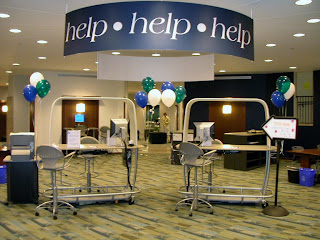
Labeled with our signature "help help help" sign, our commons desk offers library and IT assistance as well as any kind of directional assistance you might imagine. In addition to the "traditional" things, we've helped students find their advisors, parents find good restaurants, community members find where to print on transparencies, and so on. You know how it goes, and we're delighted to do it. Anyway, I envisioned this desk as the one desk to rule them all: we'll help you with anything, we'll refer you anywhere, just consider us your first stop when you have a question.
So with that line of thinking, I was adamant that we not define the desk with a bunch of signs. If we start describing what we do, inevitably we leave out something. We also make our users choose--is it an IT question or a library question? it's an IT problem, but it's with a library thing, so where do I go? or maybe I shouldn't even bother asking this person since it's neither (
here's a rant from last summer about this very topic). So despite the occasional staff suggestion for something more descriptive at each desk, I insisted that we keep it simple.
And what happens when you keep it simple?
Generally I think it works, but I can't count the number of times we've gotten "I'm not sure if you can help me with this..." or "what kind of help?" or even, "do you work here?" While there is a 20 ft sign labeled "help help help" above our heads, I can see where these patrons are coming from. Is this a library help desk to help me with library things, or is it a desk more like the information desks you see in the hospital? You can give me a room number, but you can't actually diagnose anything? Despite a lot of publicity and frequent mention in orientations, tours, and a variety of campus events, until someone is right in front of us with a need, they don't think about what exactly it is that we do.
So I relented. Let's be more specific on our signs.
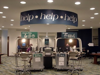
That's where the fun begins. What do you call it? Reference, research, information, library, Hub, help, assistance...then there's IT, Information Technology, Customer Support, Customer Service, technology, help...We talked about it at length, as I'm sure you have too, and kept struggling with how to label without limiting and yet be descriptive. We hit upon what I think will be the perfect solution with some simple icons (thank you, Jennifer!).
After settling on "Library Help" and "IT Help," we focused our efforts on a few icons to suggest what these terms might mean. We have a terrific graphics group on campus, and I worked with them to come up with a series of concepts (thank you, Kathryn!). Once we had a few possibilities, I showed them to staff and students and asked for feedback. There was some discussion about using which icons on which signs, and particularly if we should use the old-school library icon, but it seemed right. We tweaked the design a few times, and finally settled on our new look which was just installed last week.
Like the "help help help" sign, the new upper signs are visible from the front and back. In addition, the new design gives us the opportunity to lose all those plastic frames lining the desk--ugh--as the lower signs includes space to post hours and announcements as well as hide the impossible-to-hide cords and cables in our very open desk design.
What do you think?

 Earlier this month while at EDUCUASE Southeast Regional, I had the opportunity to visit Georgia Tech, one of the libraries that inspired the Hub. When I visited last summer, the West Commons was still undergoing renovations. I was delighted this time to see the the finished project which is known as 2 West. While I took a number of pictures during the quiet of summer with a pretty lousy camera, you'll really want to check out their website on 2 West which includes a number of images, concepts, presentations, and process documents related to the project.
 ly captured my attention are the partitions which create somewhat private spaces yet let light flow through. In our own research commons project, we've been pondering how to create the personal spaces that graduate students crave while avoiding any construction or messing too much with the architectural integrity of our building. I was really impressed by this particular design which included copious outlets and whiteboards, another request from our graduate student survey and focus groups.
